Monday, 22 December 2014

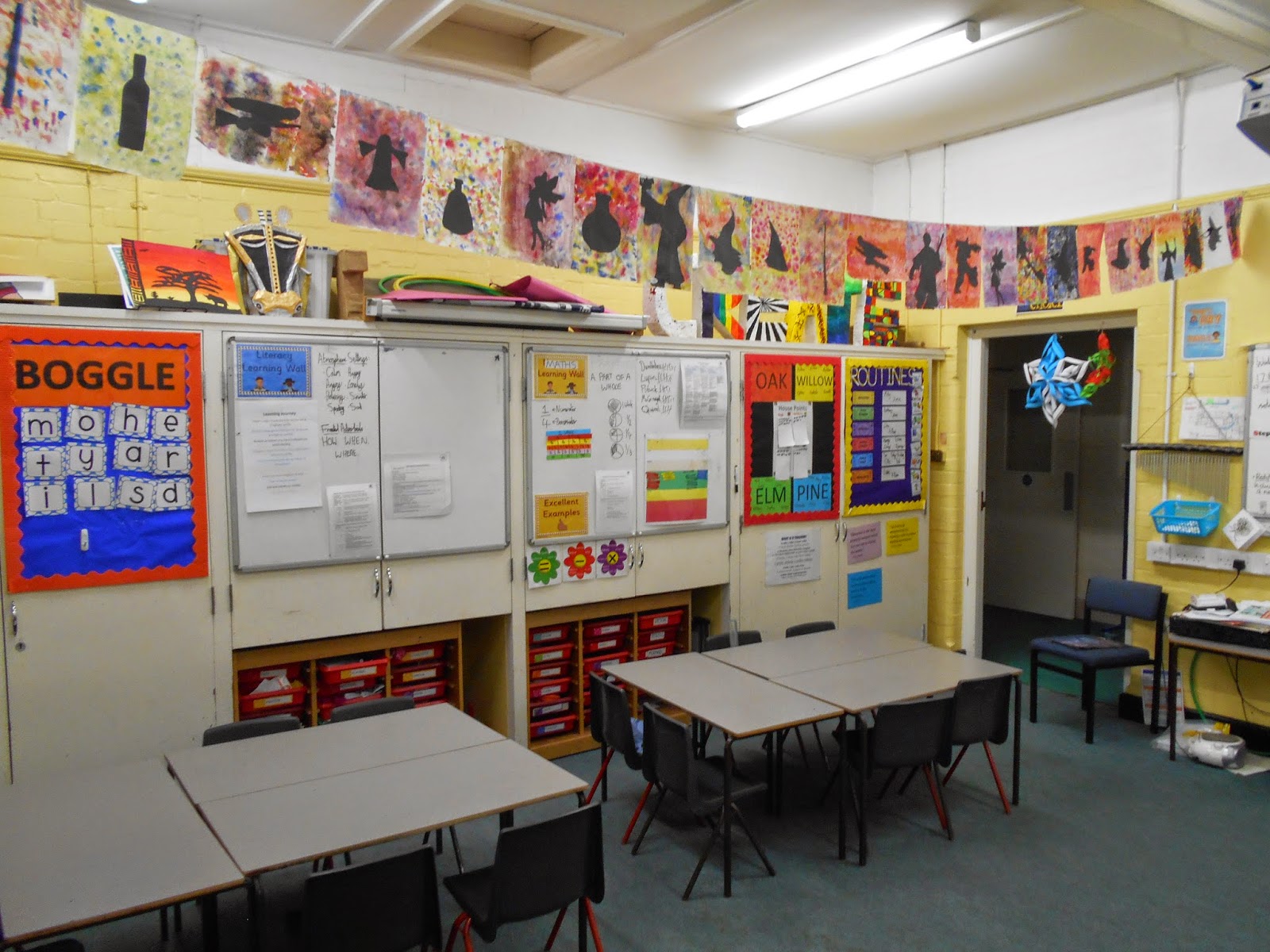
End of topic Potion display (and wands!)

Final post to bring us up to date for the Christmas holidays! We've now finished the half-term and it's been a long and tough one that included an inspection in the last week!

The children loved the creative side to this topic and I just thought I'd share our topic work display board that we've been adding to over the past few weeks. They include some work that I've already shared here (sketches/overlapping bottles) but there are also some wands there, too! We used a basic running stitch, stuffing and felt to make their wands. These accompanied their own potion bottle and magic poem.

Now it's time for a 2 week break with lots of merriment and joy. I hope all staff and students have a lovely period of time off and I can't wait to see everyone again for our next topic (lots more creative opportunities!)

A huge thanks also needs to go to the families who were generous to send in a card or present. I was overwhelmed by the kindness.

Thank you.
DB.

- Just a little extra: We're almost at 1,500 views! That's unbelievable for something that just started out as a little extra to share some work. Thanks for visiting. Please feel free to leave comments


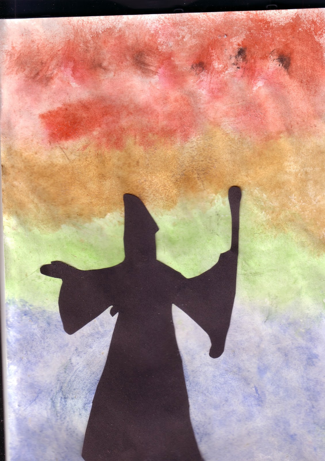
Fantastical Silhouettes

To finish off our Potion topic this half term, we created some beautiful pictures that the children could take home with them. The class was set a homework to bring in an image of a fantastical object/person/creature that they could use as a silhouette. The background was supposed to be created by blowing coloured bubbles onto the paper but unfortunately the solution didn't arrive in time! Luckily, the improvised alternative came out beautifully and perhaps even better than the first idea.

Equipment
-A4 drawing paper
- Black A4 paper
- Fantastical image for silhouette (or just draw your own!)
- Scissors
- Glue
- Watercolours
- Paint
- Salt

1. Wet all of your A4 drawing paper with a brush. Then, choose complementary watercolours and dab the wet paper and watch the colours mix and blend together.

2. Whilst the paper is still wet, sprinkle some salt over the paper. You will see the colours get "sucked in" and make a really cool effect.

3. Cut out (or draw) your silhouette image carefully. Glue it onto the black paper.

4. Cut out the silhouette shape from the black paper.

5. Glue the silhouette onto the background when it is dry.

I was so pleased with these pieces of artwork. During lessons, I often found my eyes looking up at the art as it was so amazing. The photos haven't done them complete justice but give you a good idea.


I am INCREDIBLY pleased with these and they all came out brilliantly. This was probably my favourite project so far this year as every student was successful.

DB.

Friday, 19 December 2014

Potion Bottles


Continuing our "Potions" unit, we decided to create our own potion bottles! Children were asked to bring in a glass bottle which preferably took an interesting shape. Some decorations were provided such as pipe cleaners and tissue paper, but many opted to bring in their own additions to help them create their potion for a specific purpose. For example, we had a couple of potions for Christmas so a couple of children brought in tinsel and baubles.

Once the bottles were finished, we added water and food colouring to give them that eerie glow!


A very tricky (and messy!) project but I feel these were a strong attempt.

-DB.

Friday, 14 November 2014

Class Art- Overlapping Potion Bottles

This week's art lesson was a cracker! I've had a beautiful piece of work pinned for a while that I found here but never had a way of incorporating it into school. With our new topic, Potions, I finally have a unit of work where it can fit in perfectly.

We've been looking at lot at potion bottles and glass designs which gave us a good head-start. We observed pictures of overlapping wine bottles and glasses and the children were hooked with the colours straight away. So, these are the steps that we followed to try and reach the target of the one below that I made. This was slightly simpler but still gave them a challenge!


Equipment
A4 black paper
A5 white paper
Oil pastels
Scissors

1. Each table started off with a black A4 piece of paper and lots of A5 sheets of white scrap paper. First, children had to fold this A5 paper in half and draw the shape of half a bottle. They then cut this out and it opens up into a perfectly symmetrical bottle shape. This then became a stencil for them to use.

2. Children created and cut out their bottle designs to fill the page and once happy, they could start using a different colour for each design. We used oil pastels for this activity. I stressed that each glass had to be overlapping with at least one other and I also wanted to see some glasses in the foreground and some in the background. This could be achieved by some having their base lower down the page and those at the back having their base higher up the page.

3. Once all the outlines were done, we imagined a small arrow in the top corner of our page which acted as light. Children then took a white pastel and went along the outlines of the bottles that would be directly in the light. On the opposite side, they thickened the line with the same colour that they had used and then smudged in towards the centre of the bottle. This made it look more 3D and realistic.

It wasn't too tricky a project and only took just over an hour to complete, Some children tapped into their creativity and attempted different shading styles and some tried to create shadows. Other teachers passed the room after-school and complimented how well they had all turned out.

Here they are!


Everyone did such a great job but unfortunately I can't post 30 individual pictures! Well done and keep trying more at home.

DB.

Monday, 10 November 2014

Class Art- Potion Bottle Sketches

Right, this should bring us up to date! This half-term our topic is called 'Potions' and last Friday we did our first art activity related to it.

We looked at a range of pictures of potion bottles and discussed their shapes and designs. We then looked at a short video of an artist sketching and some other pencil drawings of bottles. We talked about form and shape and then sketched rough ideas for our own bottle.

In year 3, we did some sketching but we never really broke it down to the basics. As you will see, sketching isn't a strength of mine but I thought if I could break it down into easier steps for the class then we might end up with some interesting results.

Step 1
Lightly draw a rough outline for the potion bottle. It is important to push very gently and to use short strokes rather than just one continuous line.
Step 2
Pupils were then told to draw a small arrow in the top-left corner of the page. This shows where the light is going to come from. They then had to go over their outline much more firmly where the light would not be able to reach.
Step 3
Next, children carried on shading, though not as dark, along the outlines that aren't in the light. The shading should be going towards the middle of the bottle.
Step 4
We had previously discussed about the use of smudging and how to do it carefully and purposefully. They could then carry on smudging their pencil towards the centre of the bottle again. I told the class that I didn't want to be able to clearly see pencil-marks where they had been shading in step 3.
Step 5
Students could finally shade in a light shadow on the surface and add any extra final details/shading until they were satisfied with their work.
As I said, sketching/drawing isn't my strength at all (and some of the children put me to shame!) but I was still quite pleased with this basic work and feel that the steps can be used with good success. Here are some examples:


Many of these children had previously struggled with light sketching and taking their time and would never have thought they could produce such realistic-looking sketches. They listened very carefully and I feel they all achieved something in this lesson.

DB.

Class Art- Roman God and Goddess Statues

Next project! This was another activity planned in for our Roman Day which went incredibly well. Children were previously set a homework to design and sketch their own Roman God or Goddess and had to give them a personality.

Their task was to use clay to then create their god. Each child had a few basic tools, a big clump of clay and about 45 minutes to crease/smooth/roll their creation.

I've not used clay a huge amount in my teaching experience but I thoroughly enjoyed it and luckily our class TA knew a lot more about the techniques than I did.

Once the clay was completely dry, the children could coat their statue in a metallic paint of their choice. They were then permitted to use a sponge to dab a second metallic colour on to make it look more like an ancient statue.

Here are the impressive results:

 I was really impressed with their patience and hard work. Well done!

DB.

Class Art- Hot and Cold Boudicca

I'm attempting to power on through and catch up with posting these Roman activities before moving onto this half-term's topic which is POTIONS.

We discussed Boudicca and talked about who she was in our topic lessons so already had a good picture of what she might have looked like in our heads. I then showed the children a presentation all about looking at things in different ways and we discussed the use of warm and cool colours. We looked at pictures that used cool subjects and warm backgrounds and then swapped them around to see how the perspective changed.

The class agreed that if the subject uses warm colours it suggests that they are the strong and dominant force. However, if the subject used cool colours and was surrounded by warm colours, the subject appears to be overpowered.

I tried showing the class the difference as shown below:
Children could choose to sketch and colour in their Boudicca in either style depending on how they wanted to depict her.

Here are some examples of the results:

Unfortunately, most went for the cool background and warm foreground so we didn't get to see much of a comparison, but they were still very well done. Next year, I might split the class in half so we get to see the difference!

DB.

Bringing some extra colour to the classroom

Having spent so many hours on Pinterest over the holidays searching for fun art activities, I couldn't help coming across lots of melted crayon art. There are so many different takes on it with so many beautiful outcomes so I thought it would make a lovely addition to the classroom. Many of the resources I used were purchased through the very kind collective end-of-year present from many mums in 3B (thank you very much again!)

I used:
- Roughly 3 packs of crayons
- Glue gun
- Canvas
- Hairdryer
- Acrylic paint and paintbrush
- Stencil

Step 1
Choose the colours you wish to use and glue-gun them to the canvas where you wish. I went for the standard rainbow colours but glued them in a bit of a zig-zag to make it a bit more interesting.

Step 2
Cover your work-space (and yourself!) to ensure minimal mess. Tilt the canvas so that the melted wax goes where you want and then just keep going until you're happy. I probably ended up hairdrying for about 30-40 minutes in total but it flew by. Some colours take longer than others to start melting (why is that?) but they all worked after just a few minutes. I slowly went along the whole row of colours, let the wax dry and then carried on to get a few different layers.

I just realised that I missed out a step. The very first thing that I did was paint on 'IDEAS' in black paint down my canvas using a stencil. I chose this word because obviously in a classroom it's important to have a space where people can not only have these brilliant ideas but also feel safe sharing them. Ideas can be colourful, sometimes they mix into one another and make something fantastic. Hopefully this message has been conveyed in the work below! It's currently resting on a table in the classroom next to one of my pupil's 'Art of the Week' but I'm trying to sort out a proper hook so it can hang above the door.

Thanks for reading!
DB.


Sunday, 9 November 2014

Class Art- Mosaics


This was an amazing art project that I came across at the excellent Mini Matisse (which has loads of other great ideas, too!)

I thought this could be used as part of our Roman Day as we had previously looked a bit at the use of mosaics in Roman times. It took quite a bit of organisation and prep but I think a lot of the results proved that it was worth it. Everyone who followed instructions ended up producing a beautiful mosaic that they could take home. 

Equipment
- Empty CD case
- Variety of beans/lentils
- Glue

Step 1
We made planning pages for the children to use as shown below. They used the top grid to help them plan and construct a symmetrical pattern and then placed their CD over the 2nd grid once they were ready to transfer it to the real thing.
Step 2
When I was making my own for the model I didn't have the grid but you get the idea. First, you plan onto the paper to make sure everything works and you're happy with it. I started from the centre and built outwards.
Step 3
Once you're happy with your design, you can get your CD case ready. Glue a small section at a time and slowly transfer your plan onto the CD case. Don't worry about using too much PVA as it should dry clear.

Step 4
Slowly keep on transferring your plan over a section at a time. Try your best not to leave too many gaps between the lentils/beans! My model wasn't perfect because I was rushing through after school but if you take your time it will come out really well.

I was so impressed by how focused the class was during this activity. They worked very well and were almost hypnotised by the task! They were very pleased with their results and here's why:

Well done, everyone!

DB.